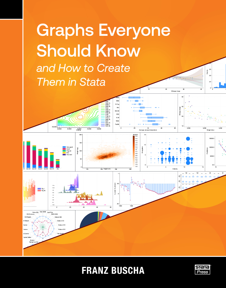
Graphs Everyone Should Know and How to Create Them in Stata
138,000원
Author: Franz Buscha Publisher: Stata Press Copyright: 2025 ISBN-13: 978-1-59718-413-7 Pages: 452; paperback
Franz Buscha's book, Graphs Everyone Should Know and How to Create Them in Stata, is written for anyone who uses Stata to make graphs. Beginners will find a complete collection of tools for effectively visualizing their data and results. Experienced Stata users are certain to learn some new tricks as well.
The chapters of the book are organized into four main sections: graphs for univariate data, graphs for bivariate data, graphs for multivariate data, and special graphs. Each chapter introduces a type of graph, explains when and why it is useful for visualizing a particular kind of data, demonstrates how to create that graph using Stata, and shows a few variations. The special graph section covers topics such as how to create maps, plot equations, create animated graphs, and create other specialty graphs.
Readers will find it easy to learn to make graphs by example. Buscha demonstrates most graphs using datasets that are installed with your copy of Stata, so it is straightforward to follow along. He also clearly pairs each graph with the command used to create it in a box just above the graph. If you find a graph that you wish to create with your own data, you can take the command from the box and replace the variable names in the example with your own variable names.
Buscha's book has two unique features that distinguish it from other books about Stata graphs. First, the book's goal is to clearly demonstrate how to effectively visualize different kinds of data and results from models using only necessary features. It focuses on important options but does not discuss all the options available for customizing each graph. Second, the book introduces many community-contributed graph commands that are freely available and can be downloaded from the internet. Readers may be unaware of these commands before finding them in this book, and they can learn how to use them quickly rather than spend time trying to write custom code for themselves.
Graphs Everyone Should Know and How to Create Them in Stata is a reference you will use again and again as you visualize different types of data. You will quickly find the graphs that are applicable to your data and the Stata commands necessary to create them.
Michael Mitchell is a senior statistician working in the area of sleep research as well as working on prevention of child maltreatment with the Children’s Data Network. He is the author of four other Stata Press books: A Visual Guide to Stata Graphics, Fourth Edition, Interpreting and Visualizing Regression Models Using Stata, Data Management Using Stata, and Stata for the Behavioral Sciences. Previously, he worked for 12 years as a statistical consultant and manager of the UCLA ATS Statistical Consulting Group. There he envisioned the UCLA Statistical Consulting Resources website and wrote hundreds of webpages about Stata.
1.2 Overview of creating tables in Stata
1.3 Overview of this book
1.4 Introduction to making and exporting tables
1.5 Using Unicode characters
1.6 Useful Stata concepts and commands
1.6.2 Stata macros
1.6.3 Accessing results stored from Stata commands
1.6.4 Repeating commands by looping over variables
2.2 Sample 2: Regression with multiple outcomes
2.3 Sample 3: Regression with multiple groups
2.4 Sample 4: Regression with multiple models
2.5 Sample 4b: Regression with multiple models using etable
2.6 Sample 5: Regression with multiple outcomes and multiple groups
2.7 Sample 6: Regression with multiple models and multiple groups
2.8 Sample 7: Regression with multiple outcomes and multiple models
2.9 Sample 8: Regression with multiple outcomes, multiple models, and multiple groups
2.10 Sample 9: Student’s t test
2.11 Sample 10: Student’s t test with Cohen’s d
2.12 Sample 11: Student’s t test with difference in means
2.13 Sample 12: Student’s t test with Cohen’s d and difference in means
2.14 Sample 13: Columns of correlations
2.15 Sample 14: Column of correlations: Two groups
2.16 Sample 15: Correlation matrix
2.17 Sample 16: Correlation matrix with mean and SD in columns
2.18 Sample 17: Correlation matrix with mean and SD in rows
2.19 Sample 18: Pretest–posttest randomized controlled trial
2.20 Sample 19: Table 1 showing all categorical variables, one group
2.21 Sample 20: Table 1 showing categorical variables by two groups
2.22 Sample 21: Table 1 showing categorical variables by two groups, with p-values
2.23 Sample 22: Table 1 showing categorical and continuous variables by two groups
2.24 Sample 23: Table 1 showing categorical and continuous variables by two groups, with p-values
2.25 Sample 24: Table 1 showing categorical variables, only “yes” responses
3.1.2 Exporting to a Word document with the export option
3.2.2 Customizing labels of the levels of factor variables
3.2.3 Reordering the levels of factor variables
3.2.4 Summary
3.4 Customizing the string format
3.5 Selecting the variable statistics
3.5.2 Statistics for factor variables
3.6.2 Composite 2: mean±SD
3.6.3 Composite 3: mean±SD and sometimes [minimum-maximum]
3.7.2 Titles and notes
3.7.3 The sample frequency
3.8.2 Customizing display of the sample frequency
3.8.3 Customizing the column order of the by-groups
3.9.2 Row headers for some variables
3.9.3 Row headers with by-groups, tests, and N as separate labels
3.9.4 Row headers with by-groups, placing total first
3.9.5 Showing yes-only responses
3.10.2 Summary statistics, by two groups, with p-values
3.10.3 Composite results, by two groups, with p-values
3.10.4 Summary statistics, by two groups, with p-values, headers, and yes-only responses
4.2 Multiple regression models
4.3 Several models (model 1, model 2, and model 3)
4.4 Multivariate models
4.4.2 Multivariate regression using sem command
4.6 Models including factor variables
4.7 Models including interactions of factor variables
4.8 Logistic and other nonlinear models
4.8.2 Poisson regression
4.9.2 Zero-inflated models
4.10.2 Titles, notes, and stars
4.10.3 Composite results
4.10.4 Standardized coefficients
4.10.5 Customizing labels and headers
4.10.6 Adding customized headers
4.10.7 Making tables that include model statistics
4.10.8 Results you can access via the result dimension
4.10.9 Using autolevels
4.10.10 Customizing cells
4.10.11 Custom styles
5.2 Regression tables with multiple models
5.3 Correlations with summary statistics in the rows
5.4 Correlations with summary statistics in the columns
A.1.2 Adding and customizing text
A.1.3 Adding formatted titles and formatted notes
A.1.4 Multiple lines of formatted notes
A.1.5 Dropping a row
A.1.6 Titles, notes, and stars with regression results
A.2.2 Adding and customizing text
A.2.3 Adding formatted titles and formatted notes
A.2.4 Multiple lines of formatted notes
A.2.5 Dropping a row
A.2.6 Titles, notes, and stars with regression results
A.3.2 Adding titles and notes
A.3.3 Export via putexcel
A.3.4 Adding and customizing text
B.2 Tables based on multiple estimation commands
B.3 Multivariate regression
C.2 Forgetting the modify option
C.3 Changing the wrong label
C.4 Ignoring notes or warnings
C.5 Forgetting to display the label
D.1.2 Attempt 2
D.1.3 Recap: nestreg1.do


